We all know the saying: a picture is worth a thousand words. But the real problem? Creating that picture—especially when you’re not a designer—is usually a time-consuming and frustrating task.
That’s exactly where Napkin AI steps in.
I recently spent some hands-on time with the tool, and I was genuinely surprised by how quickly it turned raw text into clean, structured visuals. Whether you’re building a flowchart, a diagram, or something in between, Napkin AI gets it done fast—and it looks good.
What is Napkin AI?
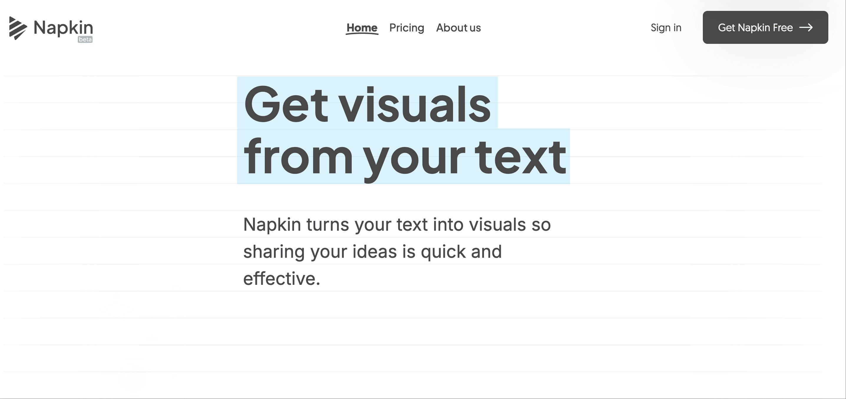
Napkin AI is a smart, lightweight tool that lets you convert plain text into visuals—flowcharts, concept maps, cause-and-effect diagrams, and more. All you have to do is paste your content into the editor and click “Generate.” Within seconds, you’ll get a visual representation of your ideas.
It’s simple, intuitive, and surprisingly powerful.
One-Click Text-to-Visual Conversion
The real magic happens in just a single step. Paste in a paragraph of text, and Napkin instantly builds a structured diagram from it. The output? Polished visuals that don’t feel generic or clunky. Even better, you can customize everything—fonts, colors, shapes, icons—to match your own style.
Need to share or present them? No problem. Export options include PNG, PDF, and SVG formats. If you want the diagram to feel less “template-y,” a few graphic design ideas can help you tighten the layout and hierarchy.
Now, if you often use visuals in presentations, this is where I’d highly recommend pairing Napkin AI with PPT.AI. While Napkin focuses on clean visuals, PPT.AI helps you instantly turn any content—text, documents, or even YouTube links—into fully-designed PowerPoint presentations. I’ve found that using Napkin to create the diagrams and PPT.AI to structure the overall presentation is a super efficient combo.
What You Can Do with Napkin AI
1. Visualize Concepts Instantly
Napkin excels at turning blocks of text into structured visuals. I tried pasting in a breakdown of Mistral’s model limitations, and in seconds, I had a clear, editable chart. (It did list “None identified” under pros—but that was easy to update.)
2. Fully Customize the Output
One of Napkin’s biggest strengths is how deeply you can customize the visuals. You’re not stuck with default styles. You can change fonts, colors, icon sets, shapes, and line types. Want to use your brand’s fonts or color palette? You can upload them.
There’s also a Custom Styles feature that’s a game changer. You can create brand profiles—complete with fonts, color schemes, and layout preferences—and reuse them across different projects or clients. It even supports over 700 Google Fonts, or lets you upload your own.
Even better: just upload an image (like a brand guide or logo), and Napkin will automatically extract the key colors for you. No need to fiddle with hex codes.
3. Sketch Freely on Top
For times when you want to add a personal touch, Napkin’s Sketch feature lets you draw freehand directly on your visuals. Perfect for quick annotations, rough sketches, or highlighting specific points during a presentation.
Who Is Napkin AI For?
If your work involves explaining complex ideas—whether you're a content creator, product manager, marketer, or educator—Napkin AI is a huge time-saver. It makes your content easier to understand, and much more visually appealing.
And if you’re someone who often presents that content, you’ll get even more value by pairing Napkin with PPT.AI. I’ve been using both in tandem: Napkin handles the smart visuals, and PPT.AI transforms them into beautiful, editable slides. Together, they’ve streamlined how I go from idea to presentation.
Final Thoughts
Napkin AI simplifies one of the most frustrating parts of content creation—visualization. It's fast, flexible, and surprisingly fun to use.
And with tools like PPT.AI alongside it, you're not just generating visuals; you're building complete, presentation-ready content without design or formatting headaches.
Try Napkin AI here → https://napkin.ai
Build your presentation with PPT.AI → https://ppt.ai
Work smarter, not harder.